Why nailing user experience is the key to startup success.
If I had to start a company again with no idea and no money, I'd rebuild something that makes a lot of money and make it better.
Wow thanks, Mathis, big insight… 🤡
Well, let me explain.
Many say distribution is everything for startups (hi Peter Thiel 👋). While it’s important, there’s something even more crucial: user experience.
Think about a product that never works or irritates you every time you use it. For me, Dashlane, Ashby, or Societe Generale come to mind.
You might think, “No way I can compete with them; they are industry leaders with good products and distribution.” Well, guess what? There is room to build a better user experience.
Every little action in an app either makes you happy or frustrated. Frustration leads to churn and bad reviews. Delight leads to recommendations and loyalty.
Startups have the edge because they can build great UX from scratch, making their products much better than existing ones. I think about this every time I use my bank’s products.
By truly understanding and caring about users, you can create something better. Big companies often forget about their users. With many layers of managers and legacy systems, they make products that are outdated and hard to use.
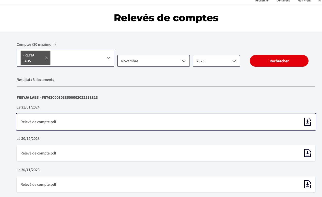
Let’s look at a simple task I tried to do for our accounting audit. Auditors asked for annual bank statements, a common request.
At Societe Generale:
- click 10 times per month to get each statement: select the month, click search, click download, it opens a PDF in a new tab, change tab, download it, go back to your SG tab to get the next one.
- this means 120 clicks for the whole year.
- they found a little trick to make you go faster: they show the statement before and after the month 😂

Qonto simplifies this:
- click once per month to get each statement.
- this means 12 clicks for the whole year.

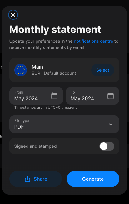
Revolut makes it super simple:
- select the period and click once to get all statements for the year.
- this means 3 clicks for the whole year.

If you start a company, be like Revolut for banks. I don’t own shares in Revolut, but it’s a great example of a startup making an industry obsolete.
Your advantage as a startup is your ability to focus on UX from the beginning. Make things simple and delightful for your users. Rebuild something successful with a 10x better user experience. That's it.
This approach applies to any industry: e-commerce, healthcare, finance, education, travel, real estate… there is no limit.
You can’t say you have “no ideas” now :)

